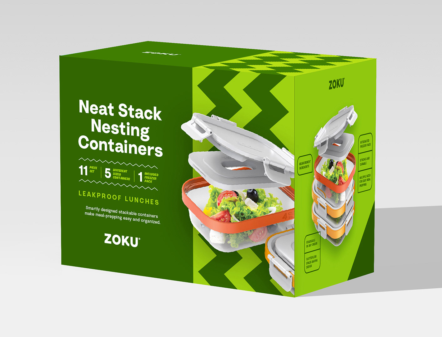
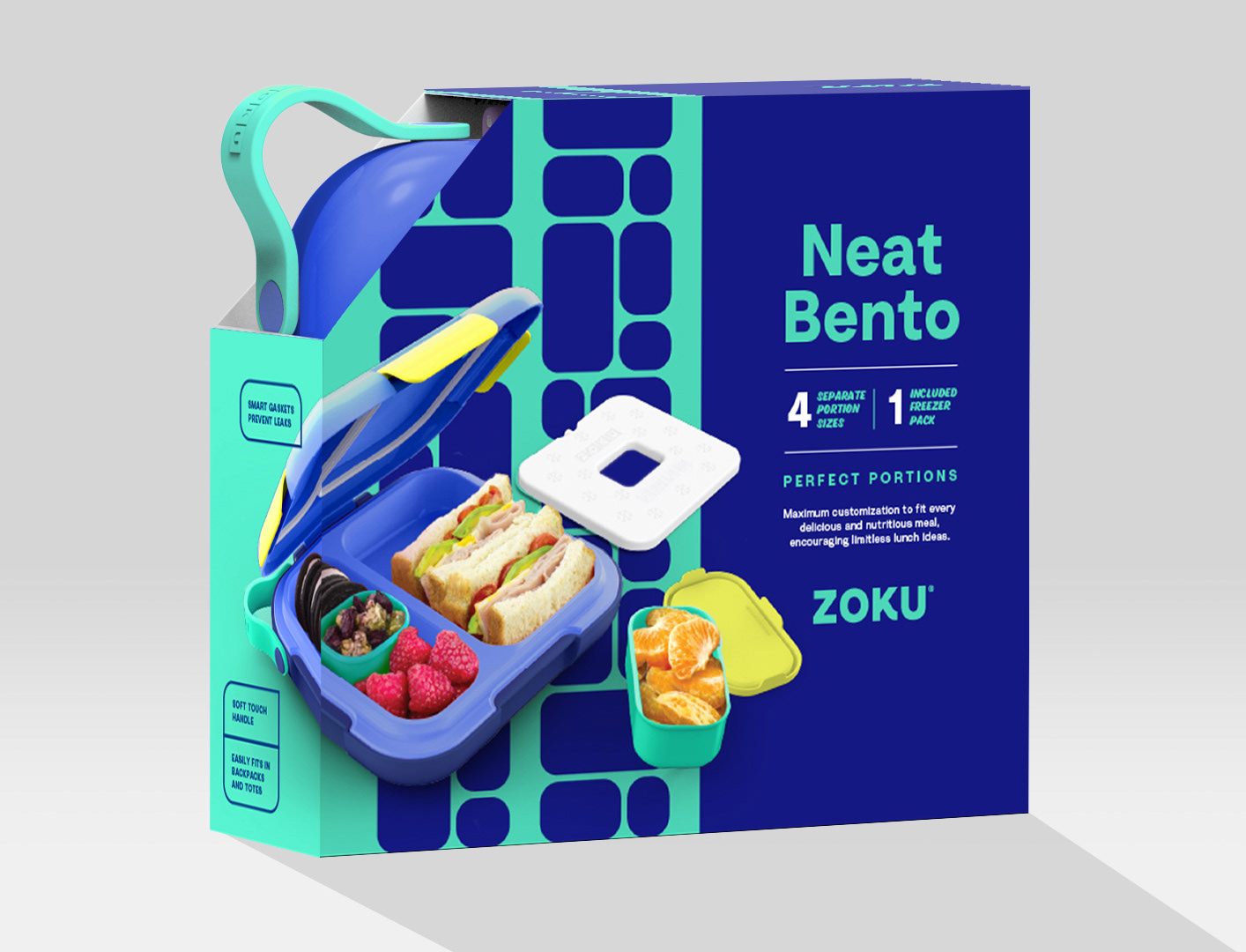
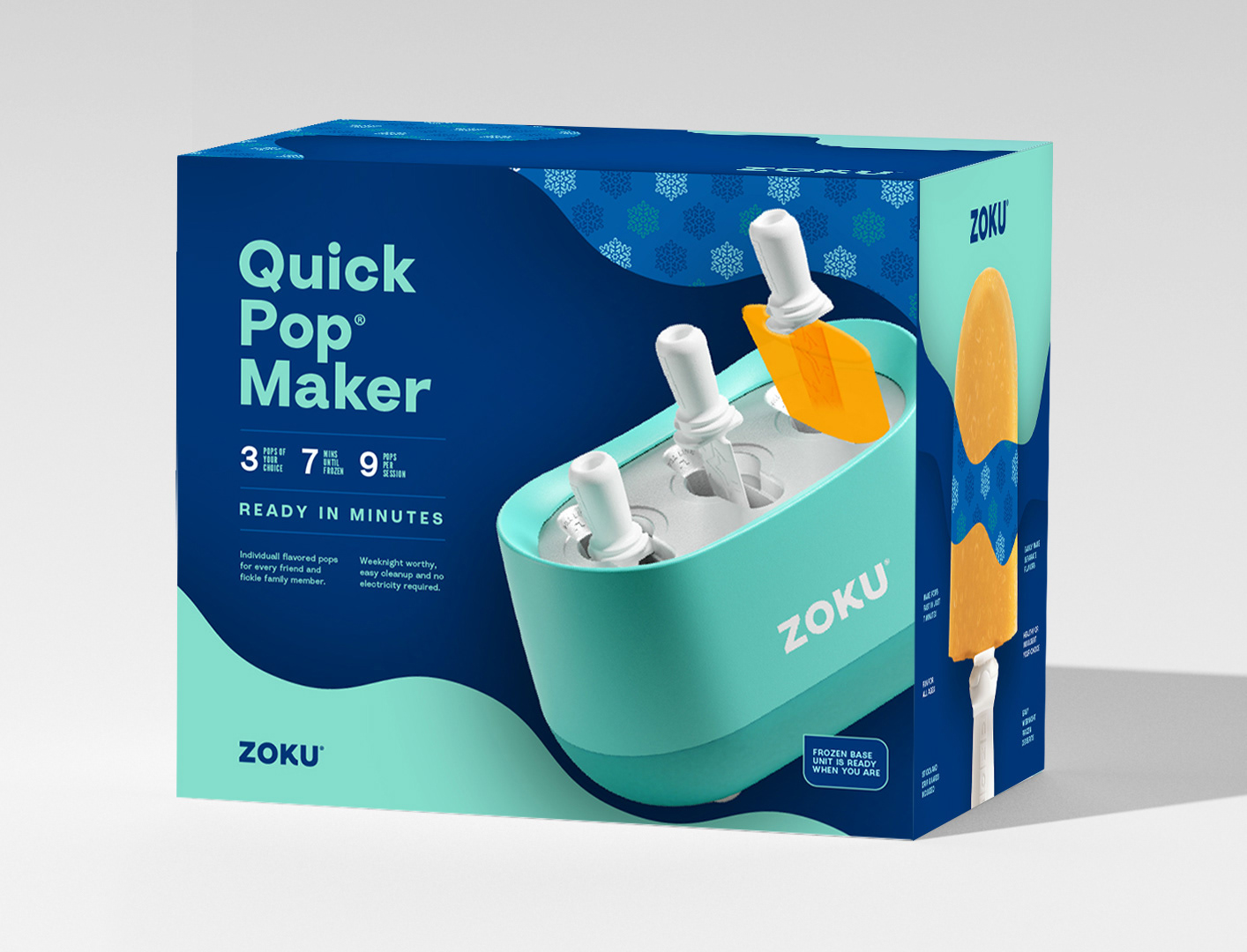
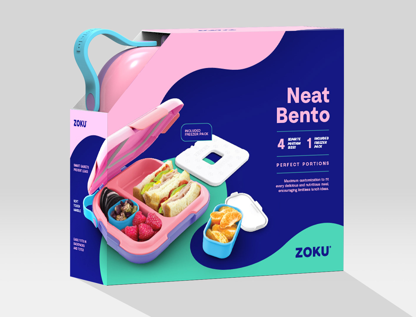
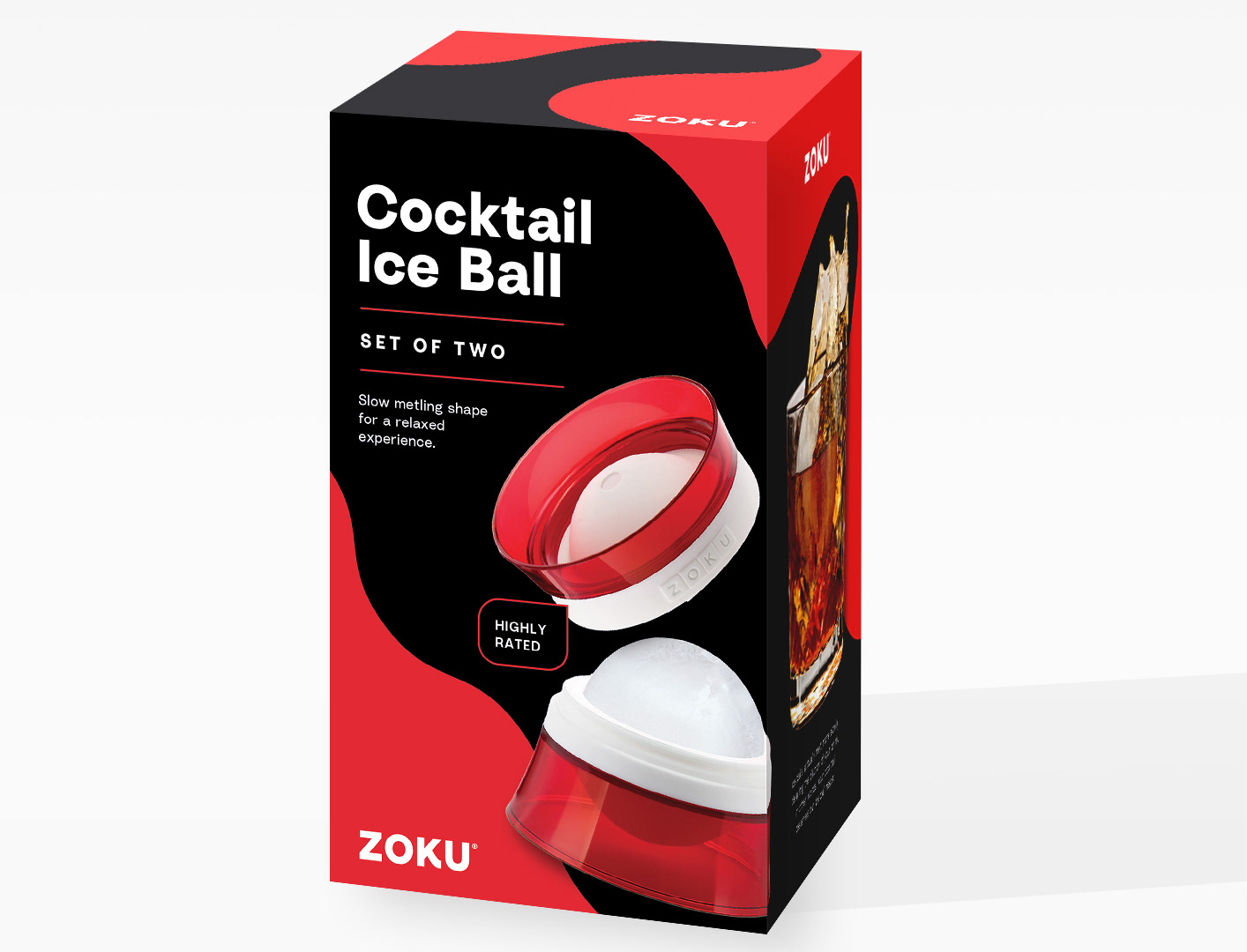
Package Design Rebrand
To corral dozens of product packages into a new and consistent design language, I first audited customer reviews to identify and more effectively communicate key decision drivers. Second, I updated the brand font to a friendly and approachable geometric-turned-humanist sans serif. Finally, I created a stronger in-store and social presence via a system of patterns inspired by the products themselves.


Unchosen "wave" concept inspired by liquid.

Retro Pattern Bottles
The Ask: Create additional patterns for rotating line of bottle graphics.
The Inspo: Flags — and tube socks.
